Project Type
UI Design / UX Design / E-commerce / B2C
Responsibility
Interface Design / Digital Prototypes / Prototype Testing
Team
Andrea Sturiale Project Manager
Simone Frosini Web Developer
Davide Pagliardini Brand Designer
David Palacios Business Analyst
Maurizio Ricucci Illustrator
Time
1 Year
*Background
Born in 2015, Astrofat is a Graffiti Supplies store based in Milan. Being official retailer of the market's best brands, it's one of the main players in Italy for this kind of niche and its Ecommerce, which features one of the widest colour choices on the web, registers nearly 1M of visits every year.
Thanks to the opening of its first shop in Milan in 2018, Astrofat has also grown into a relevant reality in Streetwear Clothing, becoming a retailer of brands as The North Face, Obey, New Era, Iuter, Propaganda, Dickies, etc. and complementing the apparel selection with a wide range of accessories, books and magazines.
Brief
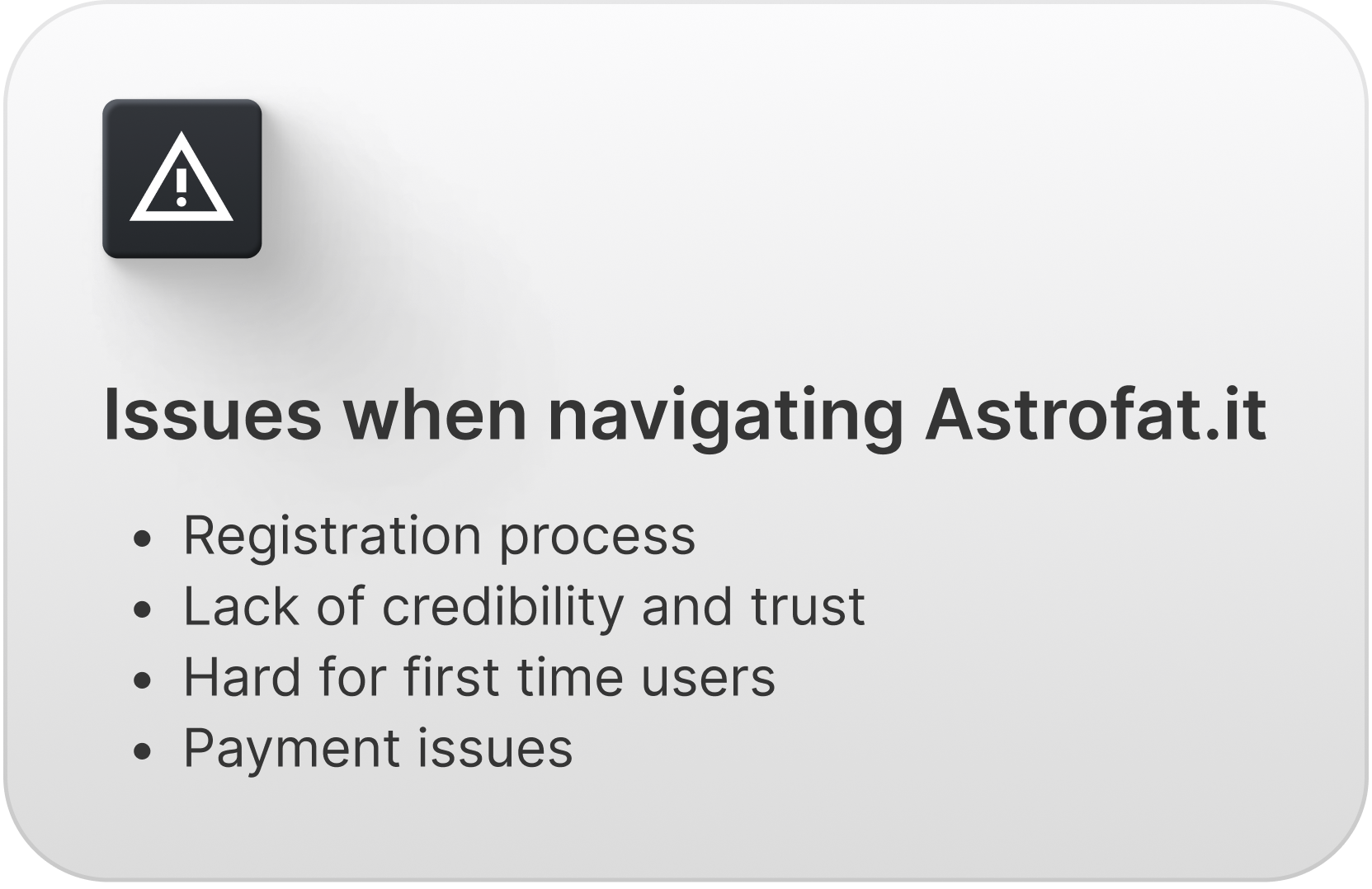
In 2022, I took on the role of Digital Product Designer to lead a major redesign of Astrofat's online shop to give the company's Ecommerce a new face. The reasons that led the company to this decision were: a slow but steady decline in the conversion rating, the many feedbacks received from users struggling with their first purchase and a perceived inability to retain customers.
As 75% of Astrofat's customers browse the online shop through mobile devices, the following case study focuses on the development of the mobile version while a prototype of the desktop version can be accessed here.
*Research
Analytics and Survey Results
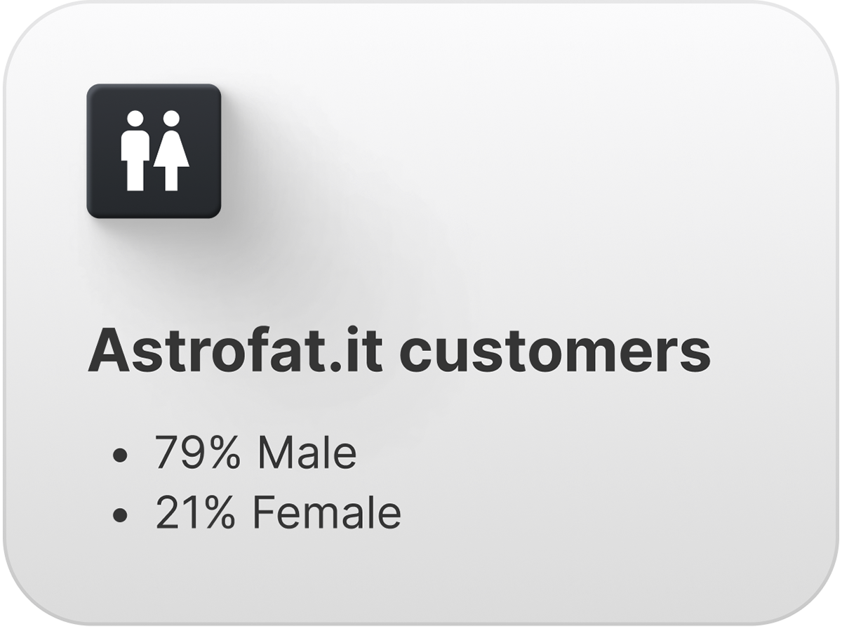
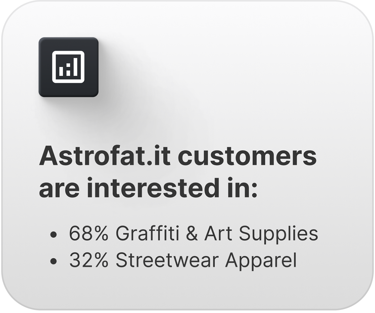
Category of Products Sold // Mail Surveys (Subscription to mail Popup) What are you interested into and want to receive news about? (Graffiti/Streetwear)



Competitor Analysis
Rains // The North Face // Spectrum // Unfade
I evaluated the following brands regarding different UX aspects and going through their searching and shopping process to get a better understanding of their features and flows.
The criteria that were assessed were: user interface, navigation and information architecture, interactivity, responsiveness, accessibility and features.
Opportunities
- Targeted product offerings: unique selections for specific audiences
- Importance of scanning categories
- Predominant and visible search and filters inputs
- Visual storytelling: showcase the culture and lifestyle associated with urban art and streetwear through medias and content to engage visitors
- Multichannel Experience: integrate the online store with offline touchpoints (physical retail locations and events) to strengthen brand consistency and enhance the customer journey
Vigilances
- Brand Authenticity: ensure that the website maintains a strong sense of authenticity and credibility within the graffiti and street art community and prioritize genuine connections with the audience
- Personalization: recommend relevant products, offer custom product bundles and provide targeted promotions based on the preferences, browsing history, and purchase behavior of the customers
- Mobile optimization
User Segments & Persona
Based on findings emerging from the previous researches (User Survey, Field Study, Competitor Analysis)
Journey Map
Based on the "Fast Shoppers" segment and applied to the Persona interested in shopping apparel
Card Sorting
We opted for a closed Card Sorting built on Maze to spot discrepancies within the existing categories and to find out if customers agreed with the way we would expect them to group the provided content.
*Highlights
Switch Menu Redesign
Considering orders and abandoned carts, Astrofat’s main customers segments tend to not mix and carts including both streetwear and graffiti items are a small minority.
As the previous version of the shop presented a single homepage with mixed banners and product grids, we opted to allow customers to rapidly switch between the Streetwear and Graffiti section of the website from the menu designing two different homepages specifically targeted towards the two main customers segments.
Personalized Filter Options
During our research, we discovered that Astrofat's customers found it frustrating to scroll through long lists of colour swatches. This can lead to an increase in abandoned shopping carts, decreasing user satisfaction and missing out on potential recurring customers.
The use of a chip selector component within product cards with a large number of colour variants eases the user experience and allows to move quickly from one colour scale to another, speeding up the process of choice and selection.Image-based Color Palette Generator
When people select colours from product cards with hundreds of colour variants, they are often looking for specific hues and combinations that were used for an old artwork, requested for a commission or simply inspired by a reference found online.
We wanted to encourage this behaviour so as to give users more control through a tool that allows them to extract a colour palette by uploading or taking a photo.
We wanted to encourage this behaviour so as to give users more control through a tool that allows them to extract a colour palette by uploading or taking a photo.
From a 6-step process
Astrofat's previous website had a 6-screen check-out process that required an average of 17 clicks to complete and a user registration requiring to set a password. Guest Checkout was available but hidden behind a long scroll and under the viewport in the Desktop Version.
To a One-page Checkout
Single page process, optimized for speed and conversion.
Reduced number of screens and interactions lead to 30% less clicks while the reduced cognitive load, positively impacts users decision-making.
Cart Editor
Smooth the process of editing multi-variants product listings.
*Results (WIP)
This substantial update will be released soon, its impact is estimated to increase annual revenue by 20 to 30%.
And that's not all!
