
Project Type
Dashboard Design / Data Visualization / Ux Research / UX Design / UI Design
Responsibility
User Needs Analysis / User Interviews / Interface Design / Digital Prototypes / Prototype Testing
Team
Paolo Barbato Product Manager
Kira Pyatakova UX Designer
Fulvio Bambusi Software Engineer
Carlo A. Gaetaniello Full Stack Developer
Andrea Bassi Full Stack Developer
Time
8 Months
Background
Wiseair is an ambitious startup born in Italy in 2018, whose mission is to enable everyone in the world to breathe clean air. Thanks to an innovative hyper-local air quality monitoring service, the startup works to help municipalities, citizens and businesses to measure and learn about air quality, creating actionable, solution-oriented data and information, and generating awareness of a problem that is often underestimated.

Making the invisible, visible.
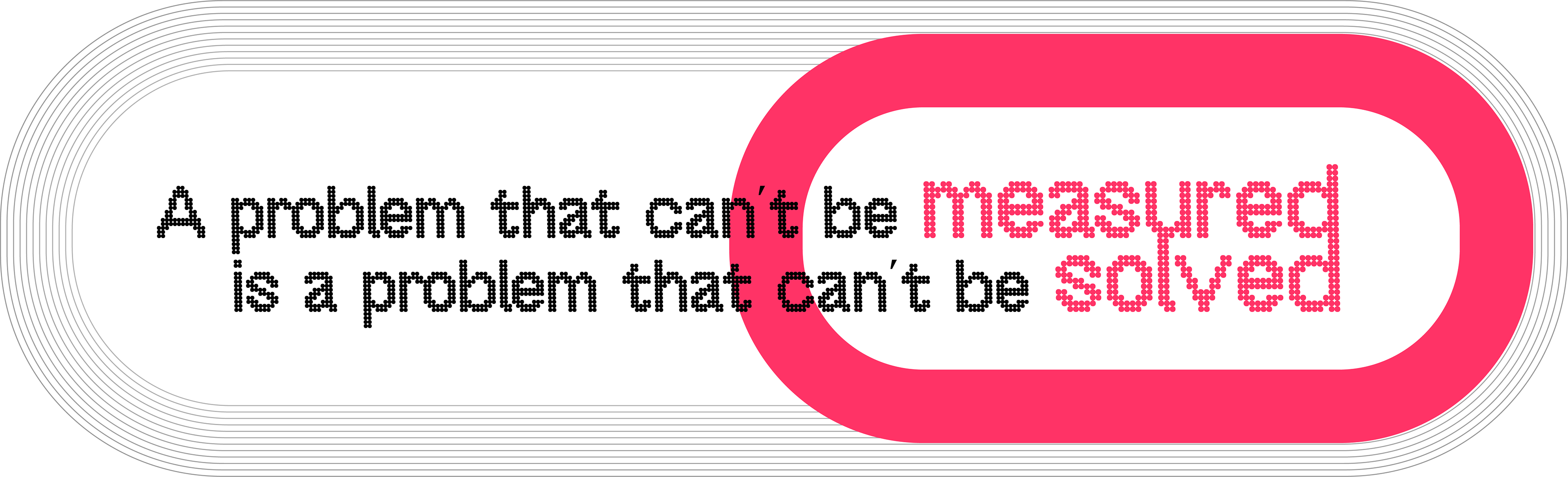
Air pollution is a multifaceted and extremely complex problem: it's an hyper-local phenomenon that varies significantly in space and time and that depends on different factors (traffic, weather conditions, heating etc.). Most governments' response is inadequate: AQ measuring stations are few, bulky and expensive, or non-existent at all.
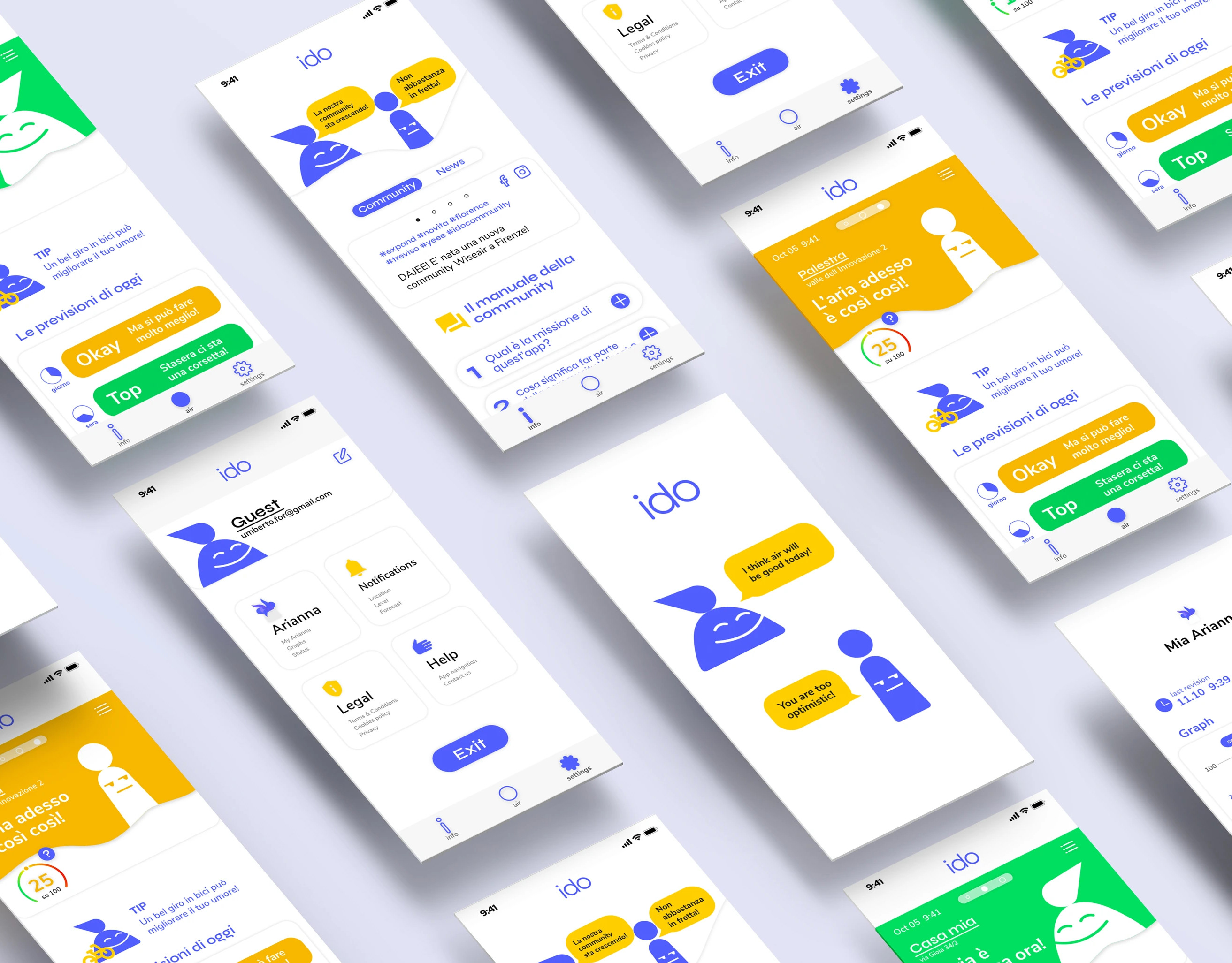
Wiseair has set itself the goal of achieving detailed mapping of cities air quality and providing a solution to measure, learn, and act against air pollution with a system that comprehends physical and digital products. The startup has developed Arianna, an IoT device with a particulate sensor to collect pollution data, consisting of a detachable module powered by solar energy, making it a fully autonomous and maintenance-free product. The sensor goes hand in hand with Wiseair's mobile application which provide access to a global pollution map that shows air quality using a color scale in the locations where a sensor has been activated, allowing citizens to know the quality of the air they are breathing.
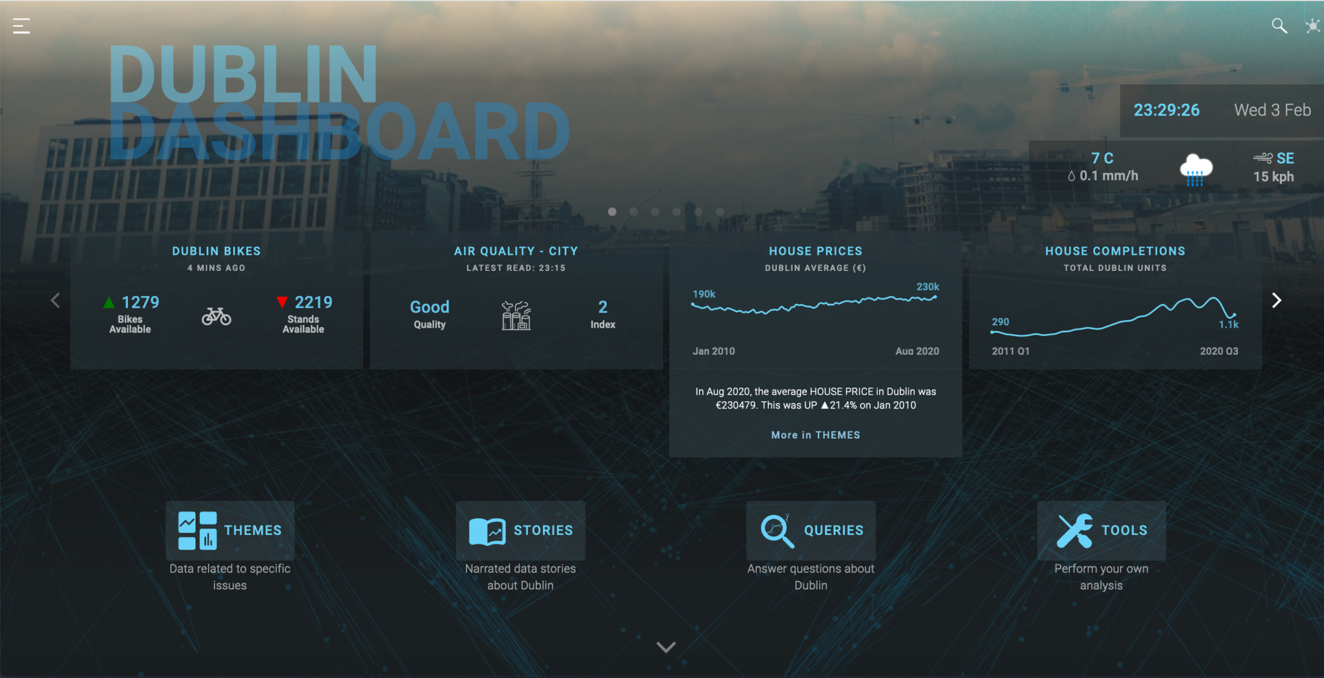
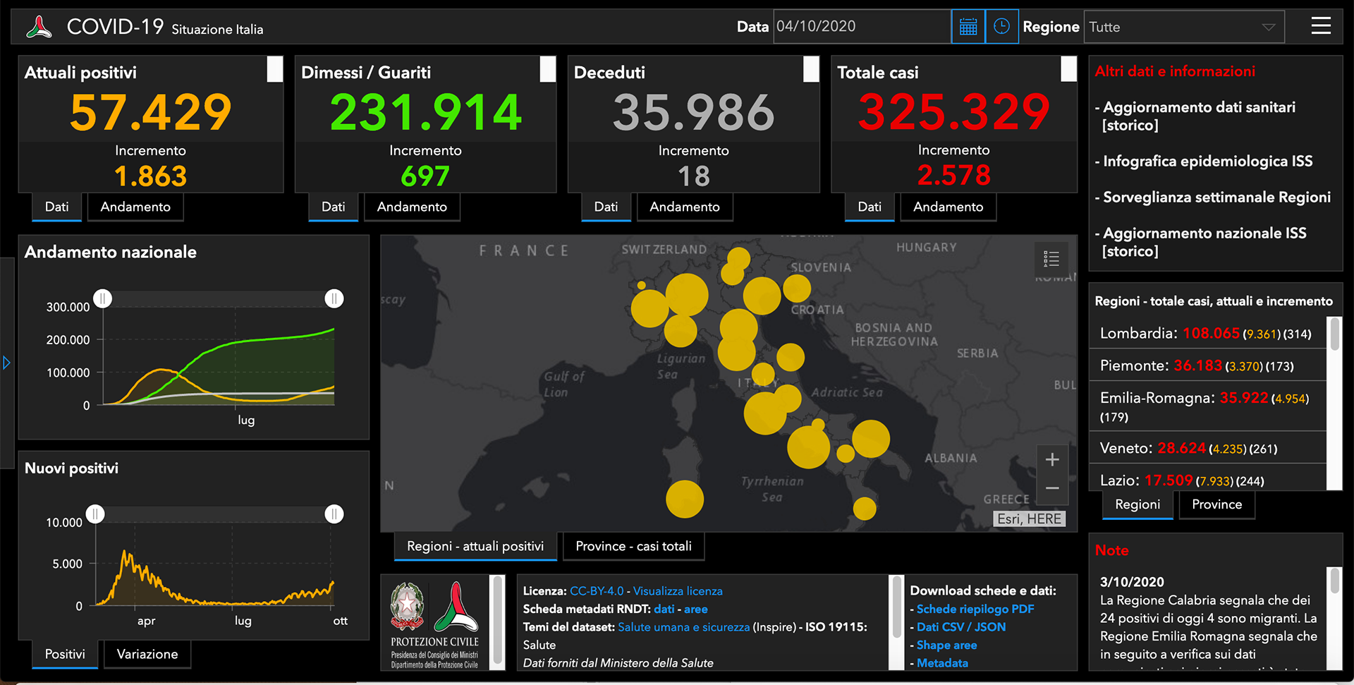
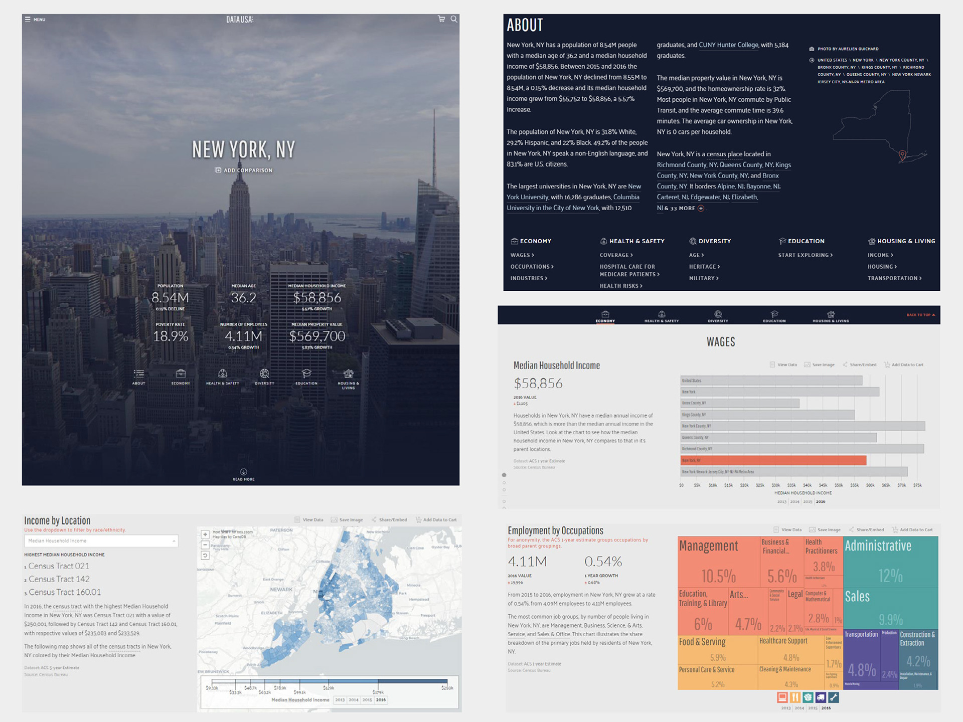
As Chief Designer at Wiseair, I was proud to lead the development of a dashboard to complement the service offered by the company with functional visualizations to help decision-makers and inform citizens about air pollution.

Methodology
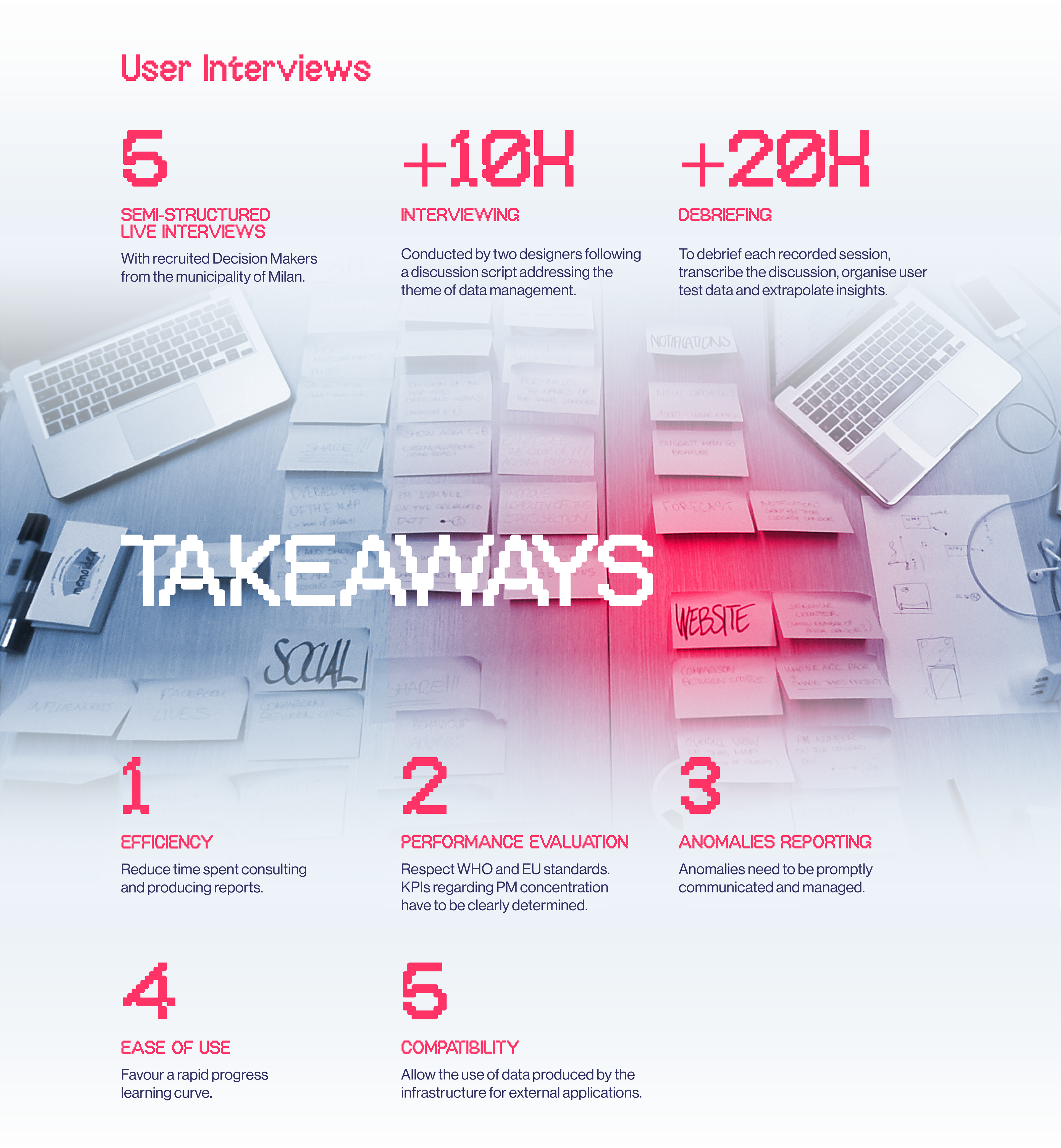
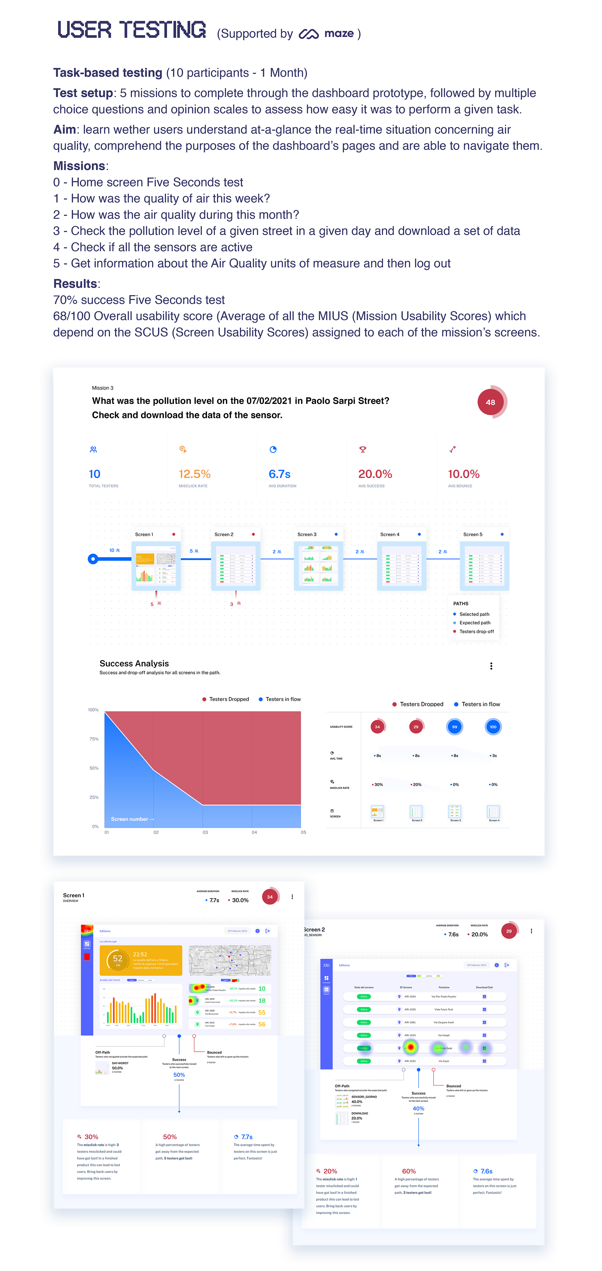
The dashboard has been developed following an iterative process which, given the premises of the existing literature and state of the art, began by collecting user's feedback. Thanks to the takeaways, a first working prototype was developed and tested through usability studies to verify its reliability and its ability to facilitate information retrieval for the users involved.
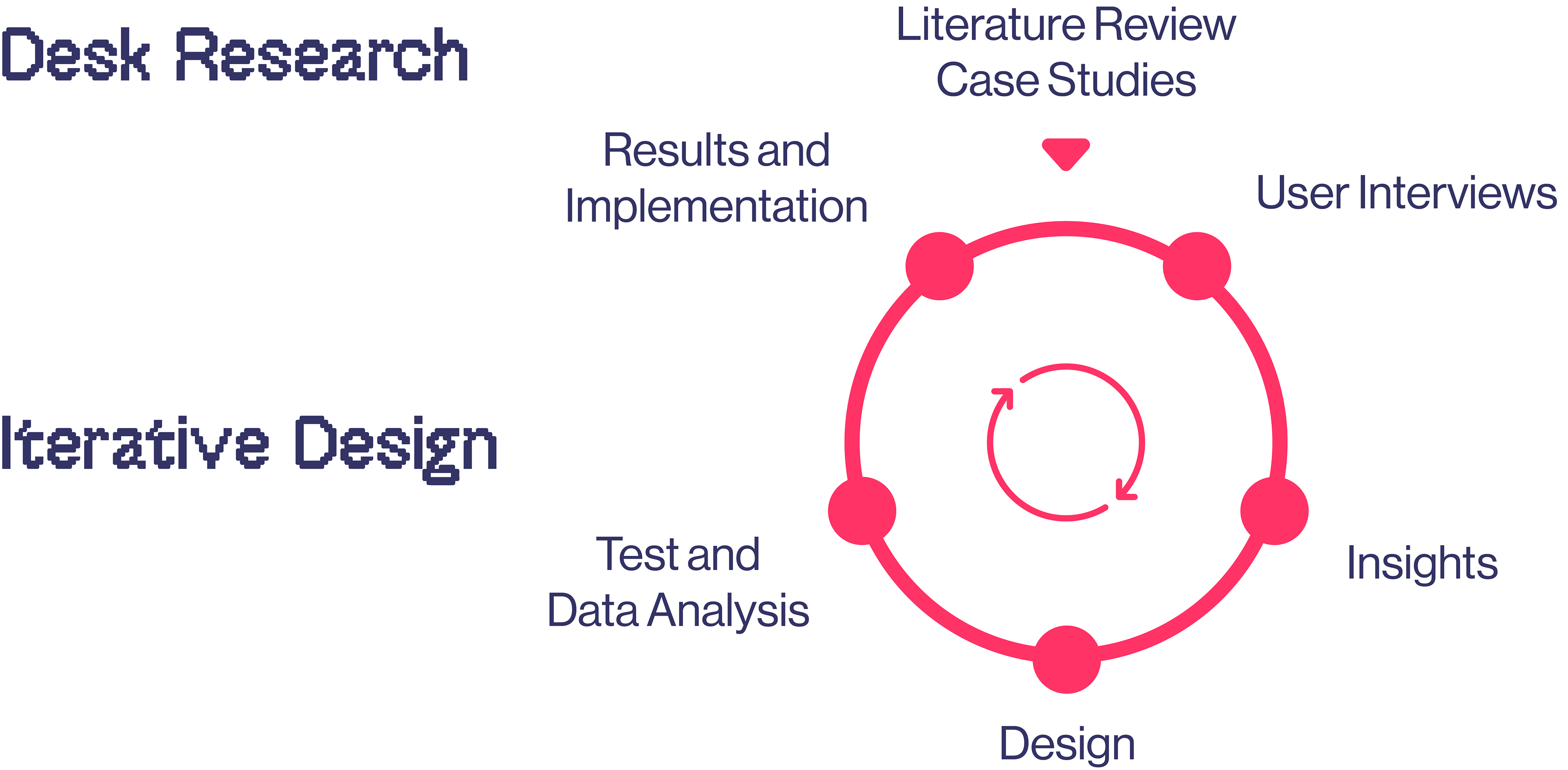

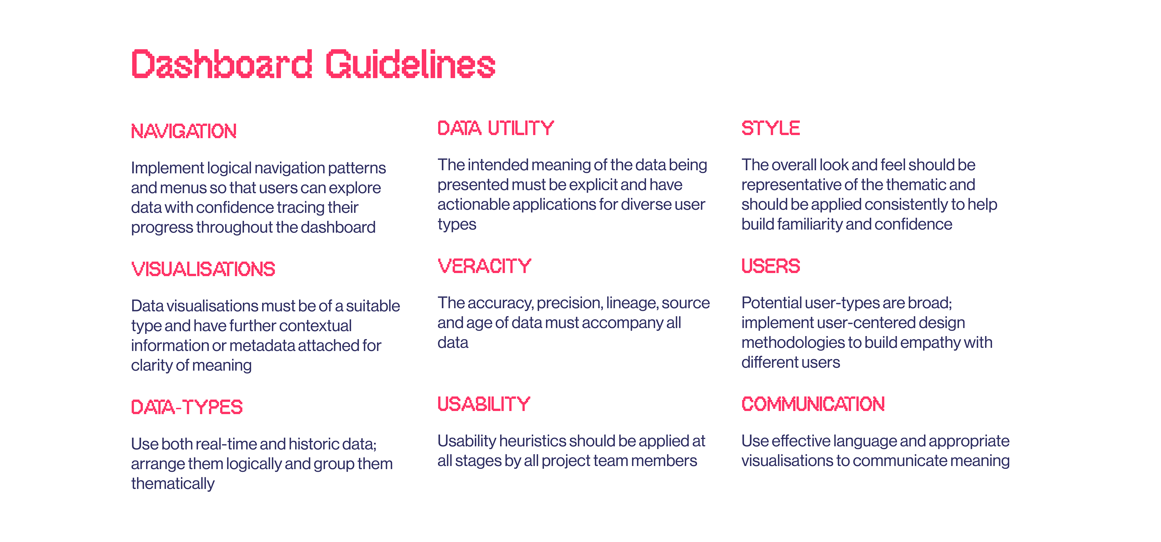
This guidelines set was defined in the beginning of the design process to drive the development of the dashboard. It underline that being in close contact with the users in a process of “empathy building” allows to put aside pre-existing assumptions and to gain insights about user’s thoughts and their fundamental needs and requirements.
Design principles
• Make data easily accessible: data should be available with the least scroll.
• Avoid static content.
• Design for different user roles.
• Non‐data pixels should be reduced to a reasonable minimum across the entire dashboard.
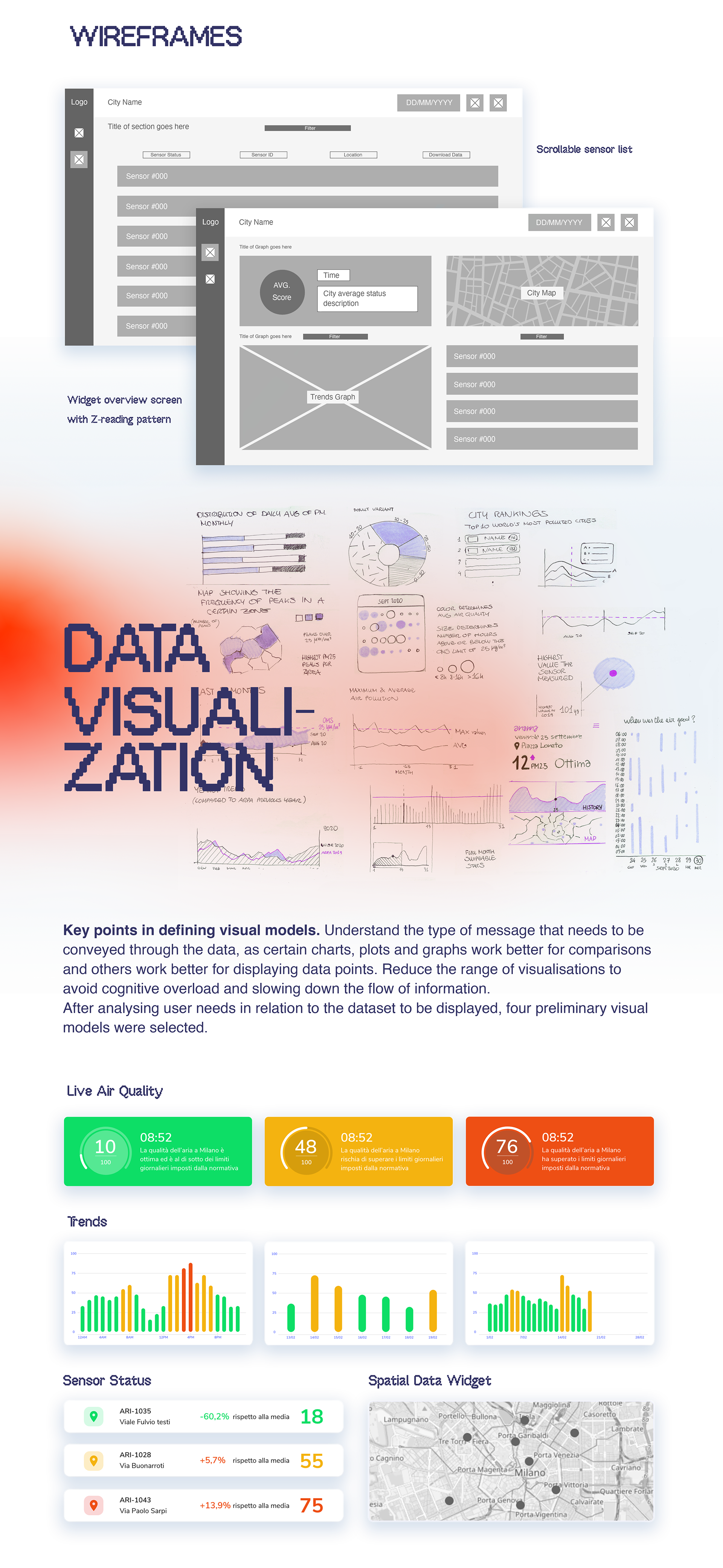
First interactive Prototype
Design tweaks:
• Reprioritisation of homepage widgets
• Introduction of units legend, toggle switch and WHO limits
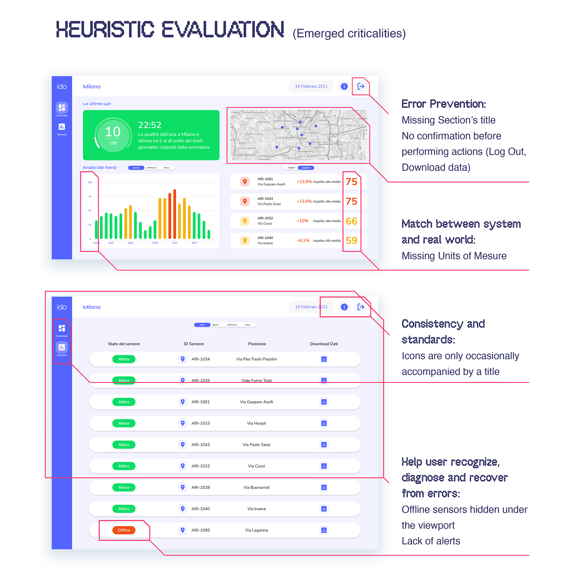
• Error prevention
• Consistency improvement
• Activation of the map and zoning
• Allowing deeper analysis of individual sensor data
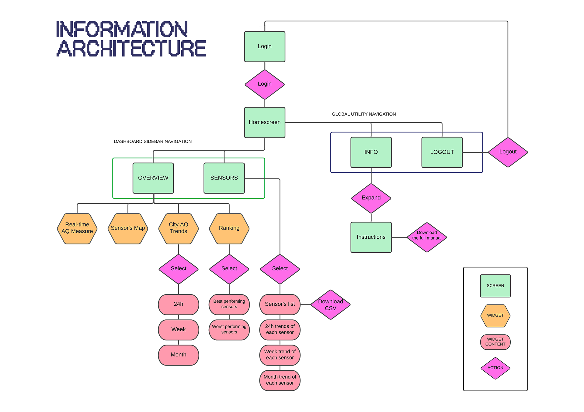
Wireflow of the dashboard's second version
🟥 = Interactions leading to other screens 🟨 = Interaction within the screen

Refined Interactive Prototype
And that's not all.